Manage schedule
5 minute read
Portfolio » Manage schedule
Making scheduling decisions clear in a complex system
Designing a scheduling experience that helps managers resolve complex reassignments through clear signals, guided interactions, and targeted overlays without replacing existing compliance logic.
The challenge: A scheduling experience that slowed managers down
WorkJam’s scheduling engine already handled enterprise-grade compliance rules, including labor laws, qualifications, and availability. However, this logic was largely invisible to the people responsible for making day-to-day staffing decisions.
The UI was outdated, non-responsive, and frequently led managers into dead ends. When an employee couldn’t be scheduled, the system offered no explanation and no clear next step. As a result, managers lost trust, workarounds increased, and scheduling decisions moved off-platform into spreadsheets and manual processes.
Why this matters
For a floor manager, every minute spent navigating a complex UI is a minute taken away from their team. This project focused on reducing cognitive load while increasing transparency: making it clear why someone could or could not be scheduled, and guiding managers toward viable options without forcing trial-and-error. The goal was to support confident decisions without compromising compliance or business constraints.
A new approach: Helping managers plan before they commit
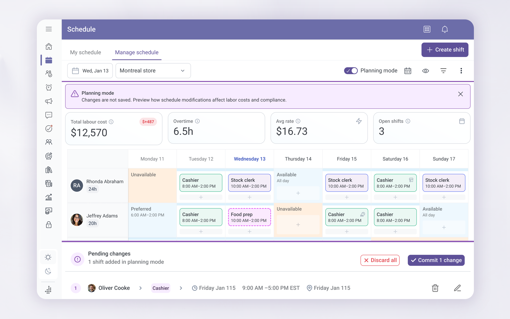
One of the biggest pain points was that problems showed up late in the process and managers had to start over.
To fix this, I introduced Planning Mode to let managers try schedule changes safely before committing them. As they experimented, the system showed how changes would affect things like labor cost, overtime, and compliance. Nothing was saved until the manager was ready.
Early versions of Planning Mode lived directly inside the schedule view. While this proved the idea worked, it also took up too much space and competed with the core task of scheduling. That insight shaped how the concept evolved.
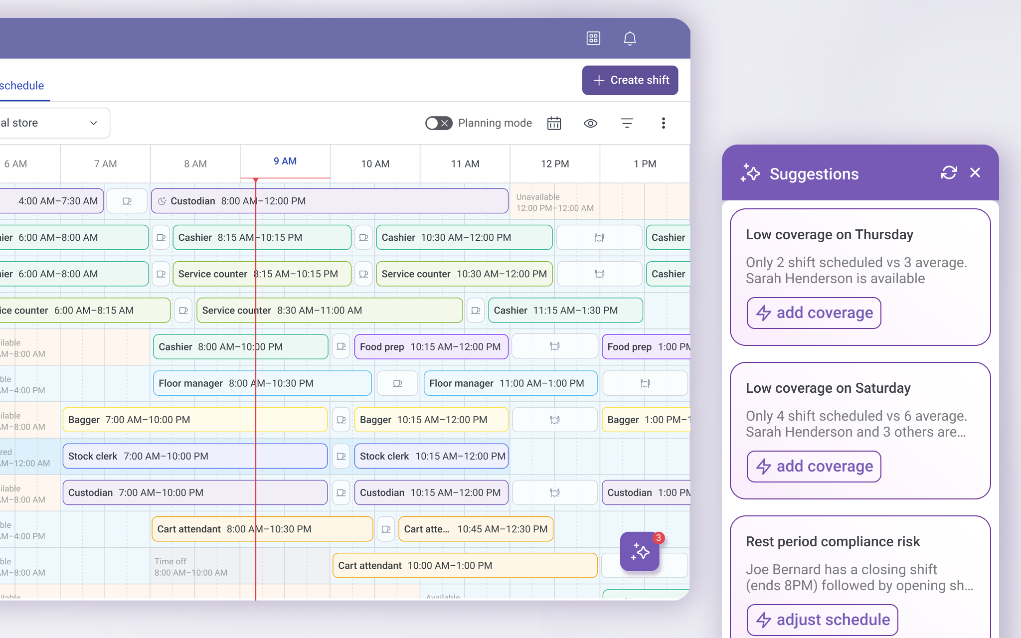
Turning problems into guidance, not interruptions
In the second iteration, planning support moved from a full-screen layer to a suggestions panel. The system highlighted issues like low coverage and compliance risks in plain language and offered clear actions without blocking progress. While this reduced trial-and-error, it also showed that pulling attention away from the schedule introduced new friction leading to a more contextual, in-flow solution.
The guiding principle: Quiet help, not loud alerts
As the design evolved, Planning Mode stopped being a large visual layer and became more of a state of mind.
The system stayed quiet when things were working. When something needed attention, it showed small signals first. More detail appeared only when managers engaged. Actions were offered only when they made sense.
This reduced noise, kept focus on the schedule itself, and helped managers trust the system instead of fighting it.
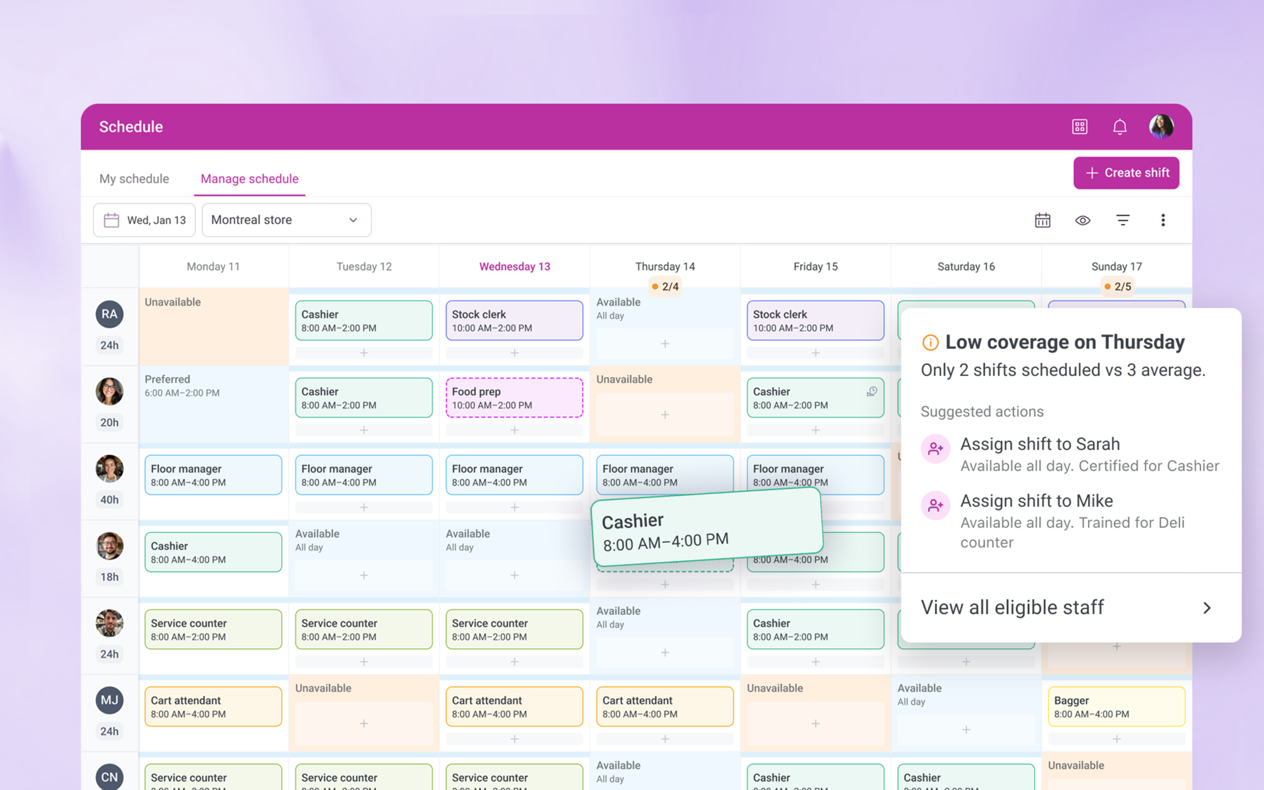
The solution: One place to understand, decide, and act
The final experience keeps everything in one place and uses progressive disclosure, showing information gradually, only as it becomes relevant. Managers can see who’s eligible, understand why someone isn’t, preview the impact of changes, and resolve issues without leaving the schedule. Simple actions stay fast, while more complex decisions are supported with clear, on-demand explanations, helping managers act confidently without unnecessary noise.
This version:
- See who is eligible for a shift
- Understand why someone isn’t
- Preview the impact of changes
- Fix issues without leaving the schedule
The result was a scheduling experience that scales with complexity while still feeling simple to use.
Quantifiable Impact
70%
faster resolution
By letting managers preview the impact of schedule changes before committing, complex updates dropped from 15 minutes of trial-and-error to under 4 minutes of informed decision-making.
30%
faster shift coverage
By surfacing eligible employees and clearly explaining why others weren’t available, managers spent far less time scanning lists or testing options that wouldn’t work.
60%
fewer failed
attempts
By progressively revealing training, badge, and eligibility constraints at the right moment, the system reduced repeated attempts to assign ineligible employees.
Restored
system trust
By making rules visible and decisions explainable, managers stopped relying on off-platform spreadsheets and returned to the schedule as their source of truth.
How we validated these results
In a 2025 operational audit, we surveyed 450 floor managers using the redesigned engine. Participants were asked to complete 12 high-stakes scheduling tasks to measure the impact on decision speed, labor compliance, and manual workaround reduction compared to legacy baseline data.
What I learned and next steps
This project reinforced that good decision support is about restraint. Making rules visible builds trust, but showing everything at once creates noise. By applying progressive disclosure and surfacing guidance only when it mattered, the experience supported confident decisions without getting in the way.
Next, I am exploring how scheduling insights could scale beyond individual stores, giving regional leads visibility into trends and recurring staffing risks across locations.
* A Note for Recruiters & Hiring Managers
This case study is a high-level overview of my approach to improving complex operational systems. It focuses on decision-making, trade-offs, and experience design rather than visual polish alone
I would be happy to walk you through a deep dive of this project during a 1:1 interview.
Quick wins
Fewer blocked schedules
Managers no longer hit dead ends when assigning shifts. When someone couldn’t be scheduled, the system showed what was missing and what needed to change, allowing issues to be resolved instead of retried.
Clear eligibility rules
Training, credentials, availability, and task requirements were made visible in context, so managers could immediately understand who was eligible to work and why.
Less trial-and-error
Instead of testing multiple combinations, managers were guided toward valid options from the start, reducing repeated attempts and wasted time.
No more workarounds
With eligibility and suggestions built directly into the flow, managers no longer relied on spreadsheets, notes, or memory to manage scheduling decisions.
Role
Decision support design
Product strategy
UX architecture
UX and UI
Team & Partners
Architect • Performance Strategy
Data Science • Predictive Logic
Product Manager • Roadmap Influence
Customer success • Domain experts
Senior Designer • Lead
Duration
- Total Project: 9 Months (Concept to Global Scale)
MVP Release: 3 Months (Core Scheduling & Compliance)